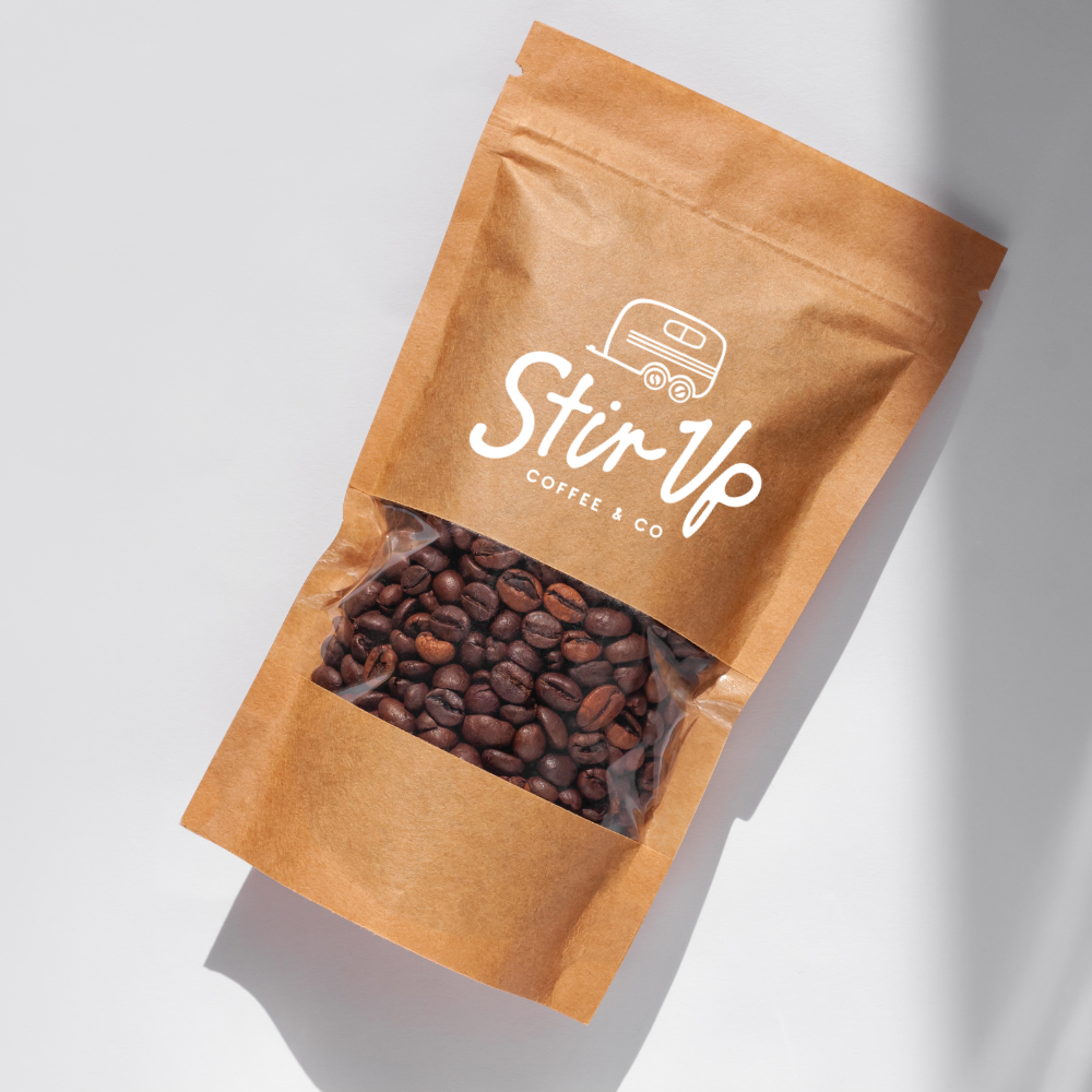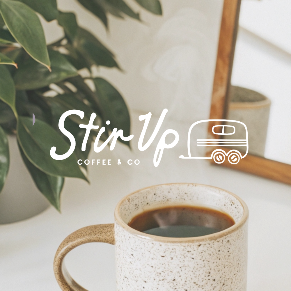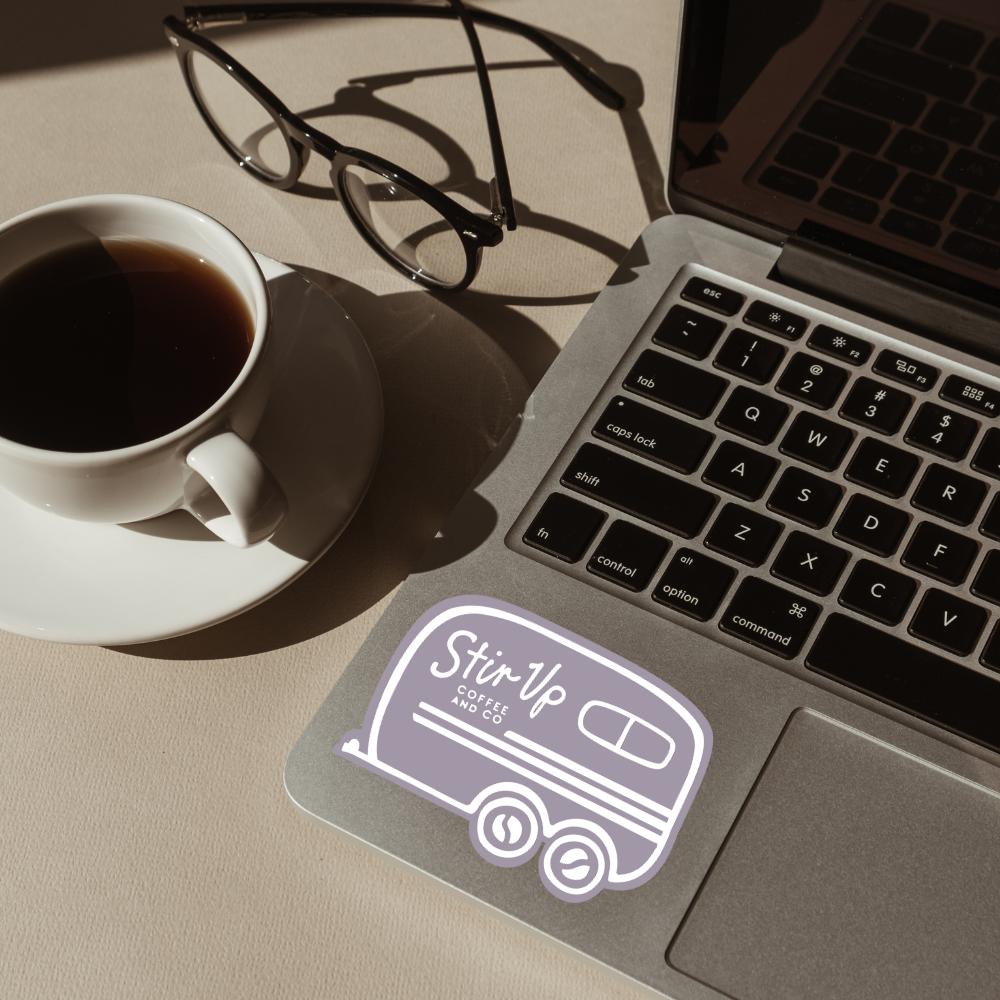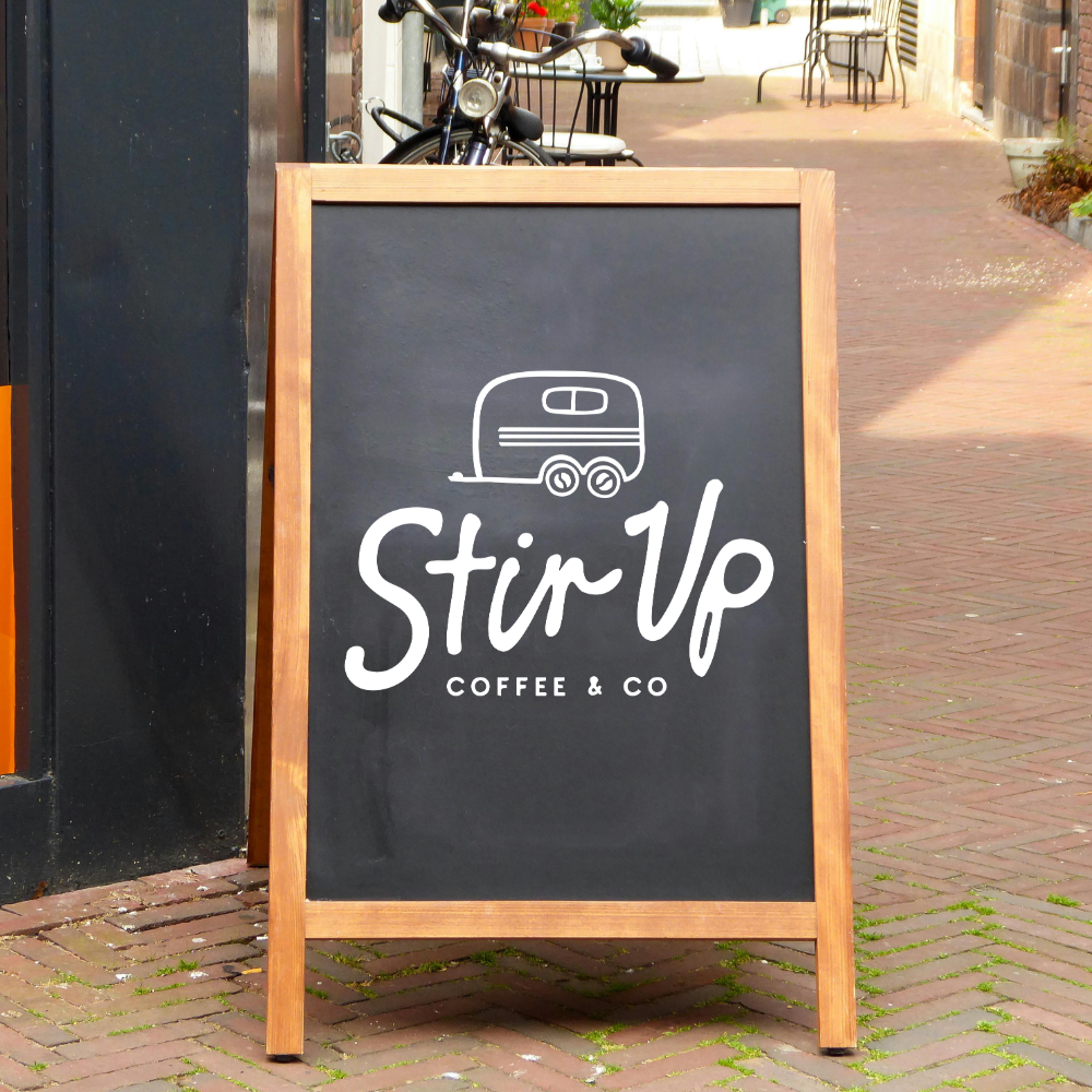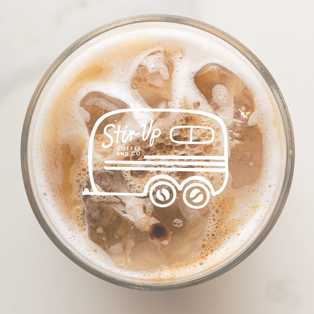

The Stir Up Coffee & Co. logo was designed to reflect the heart of a business that’s already a familiar favorite in the community. Simple, hand-drawn lettering gives the wordmark an approachable, crafted feel, while the color palette centers on Stir Up’s signature purple paired with earthy tones that feel natural and timeless. The trailer icon anchors the design as a nod to the well-loved horse trailer that locals recognize, symbolizing strong roots, connection, and the gathering place it’s become. The result is a brand that feels authentic, rooted, and built to last—just like the coffee and community it serves.
stir up coffee & co.
mobile coffee trailer
our services
- Branding & Logo Design
- Marketing Design - tshirts & stickers