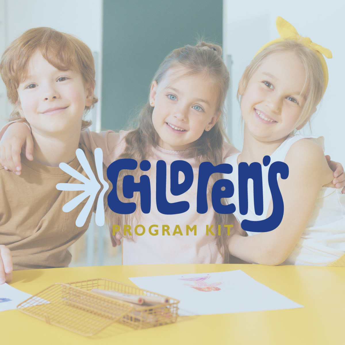

children’s program kit
program supporting children effected by addiction
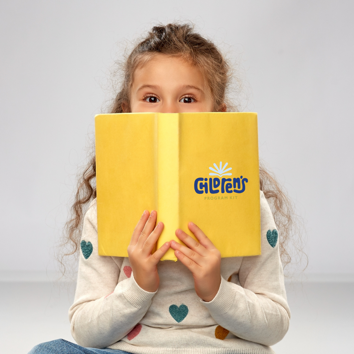
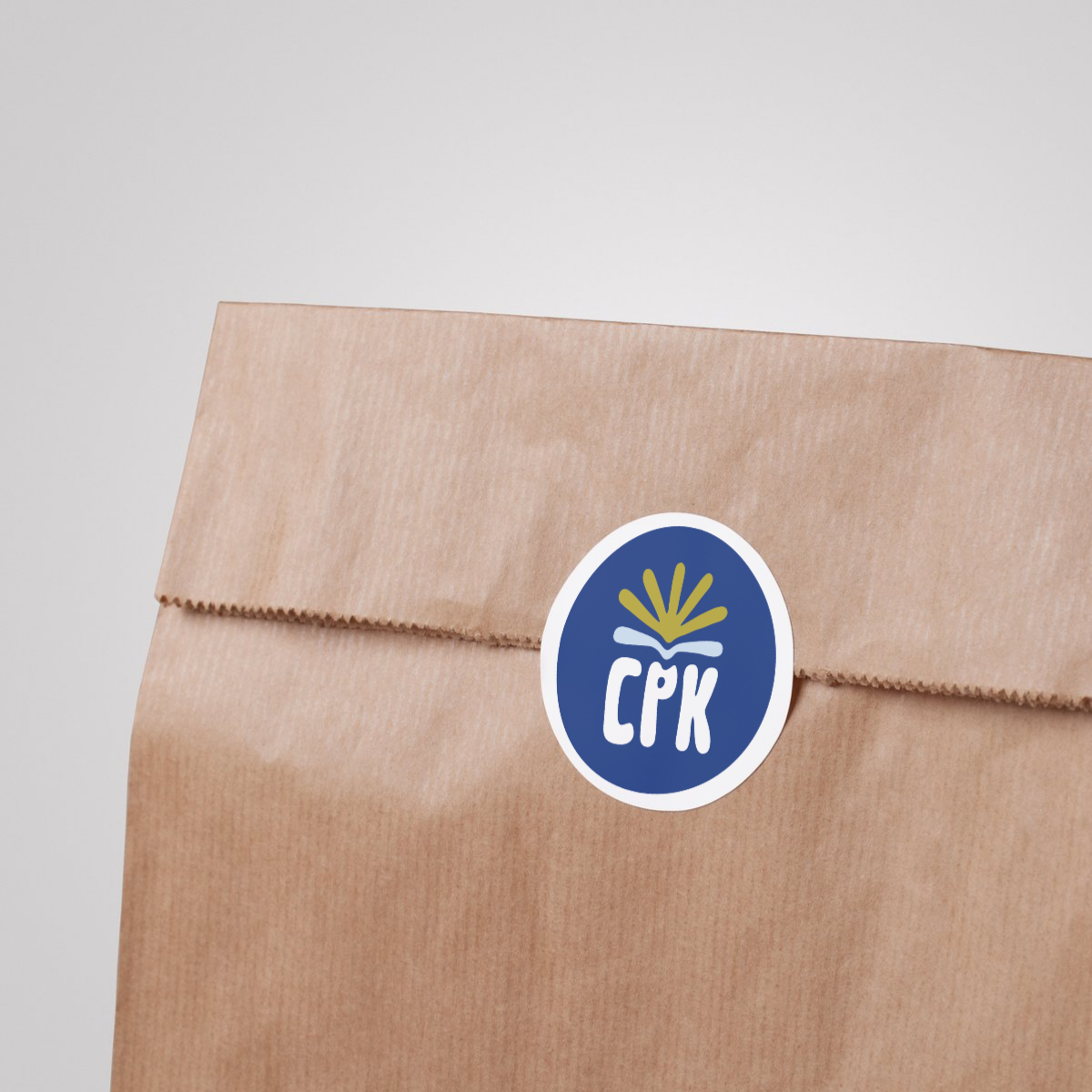
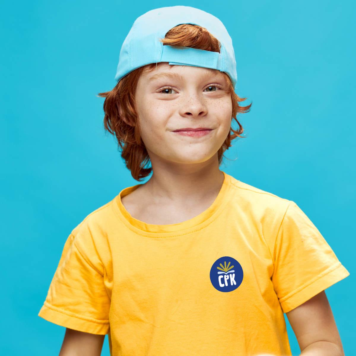
The Children’s Program Kit logo was thoughtfully designed to reflect the spirit of connection, support, and energy that defines the program. Custom lettering gives the wordmark a playful, approachable, and organic feel. The color palette combines NACoA’s established tones with fresh, vibrant hues that evoke warmth, positivity, and a welcoming atmosphere.
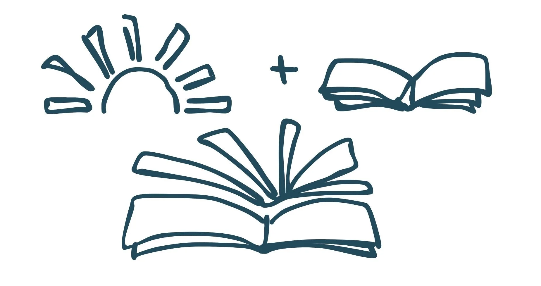
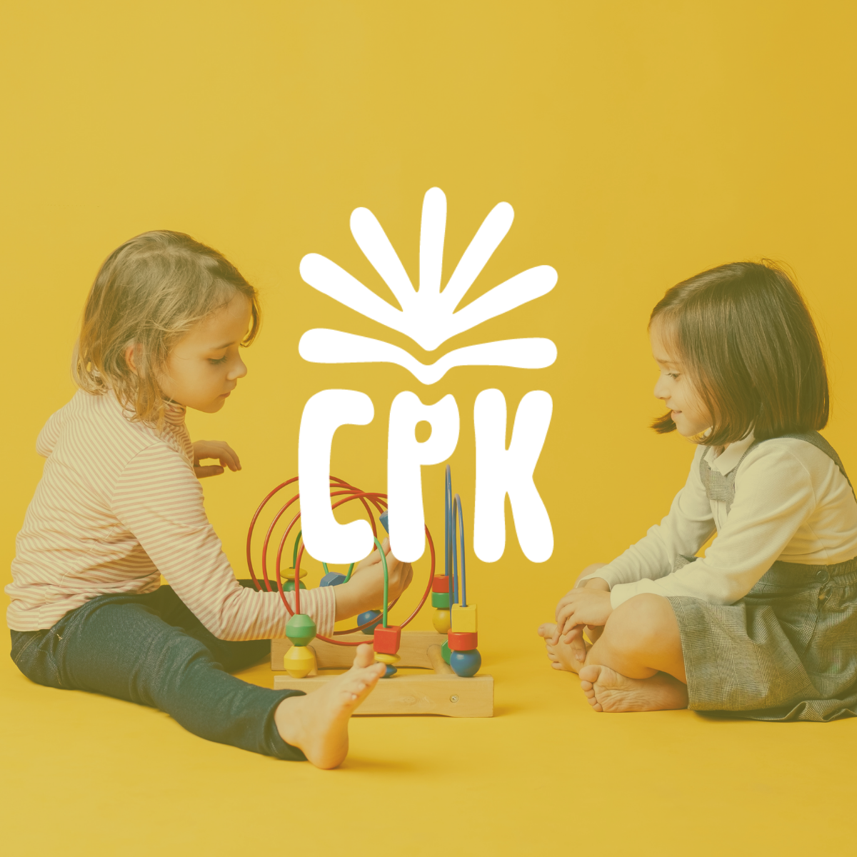
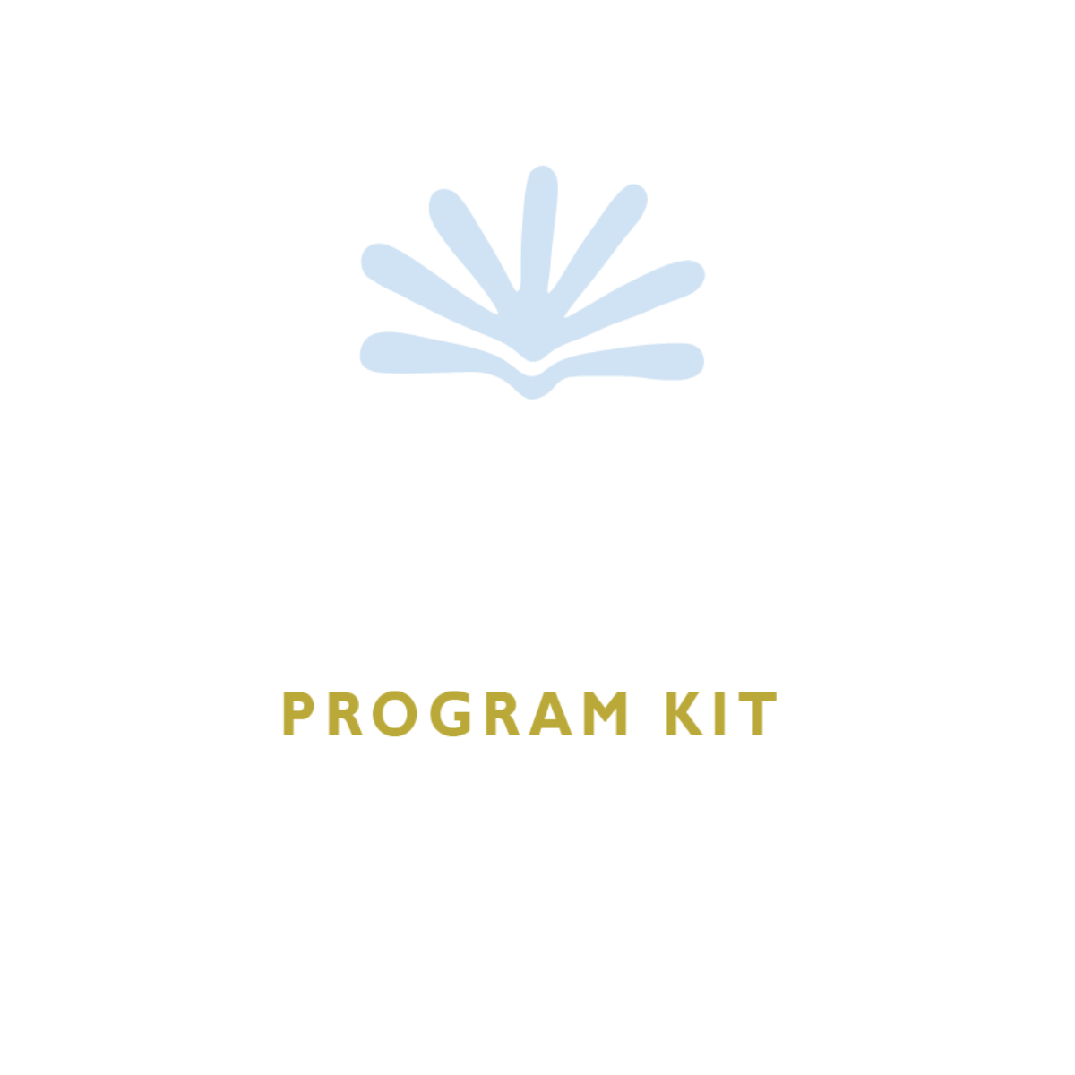
At the center of the brand is a monogram icon featuring a sun and book—symbolizing the program’s focus on education, growth, and hope. The result is a family-friendly identity that feels both uplifting and grounded in purpose, resonating with children and the adults who support them.
our services
- Branding & Logo Design
- Marketing Design - flyers & presentation templates
the concept
The logo for The Children’s Program Kit was inspired by the warmth and energy of the sun, paired with the knowledge and growth symbolized by a book. This concept blends the playfulness and brightness of the sun with the educational foundation of reading, creating a design that is both uplifting and meaningful. The final logo captures a kid-centric, inviting energy—sparking curiosity, encouraging participation, and helping children feel seen, heard, and comfortable.